Spotting investor danger zones with the MCG Landlord Win/Loss Index

Numbers are cool… well, at least I think so.
There is so much to be learned by running some well sourced digits. I love to revel in the trends and roll about in the algorithms. Stories unfold and revelations abound so you can make sound decisions and potentially profit from the pointers delivered by data and analysis.
The thrill I get from this should surprise no one who’s met a quantity surveyor. Our stock-in-trade is looking at spreadsheets of figures to help clients minimise tax or accurately assess building contracts and insurance figures.
But I like to expand my interest beyond the basics of my profession and see what else can be unearthed, and that’s led me to create a new index which should prove invaluable to anyone with a keen interest in avoiding investment danger zones.
The seed of an idea
The MCG Landlord Win/Loss Index is an up-until-recently-unknown dataset which reveals a whole range of information useful for keen property investors.
I’ve noticed how much more important household income has become to Australians throughout the past year. Given my usual job involves helping property investors maximise their annual income by reducing tax, I was delighted to take on the challenging of building the index.
The Win/Loss index identifies suburbs across Australia where landlords lose the most amount of rental income on average per month.
‘Oh Mike, what a depressing index!’ I hear some of you say. ‘Couldn’t you create something a little more upbeat?’
While I appreciate the feedback, you’re missing the point.
You see, across all property markets, there’s normally some form of rental vacancy. There might be that rare outback centre where there’s only a few rental properties on offer meaning vacancies are pretty much zero – but chances are your property investment will be empty and seeking a tenant at some stage, regardless of where you invest.
Up until now the property industry has been devoted to the idea of simply looking at rental vacancy rates as a measure of rental demand and investor risk. This metric is fine, but it does miss on one crucial front.
You see, it doesn’t measure the real dollar pain felt by average investors within each suburb. So, there was an opening to create a comparison index.
The details
The MCG Landlord Win/Loss Index calculates the average rent lost per investment property in every suburb across Australia. To reduce anomalies, it excludes any suburb with less than 50 properties occupied or available for rental.
The index uses total rental listings greater than 21 days for each suburb, multiplied by each suburb’s aggregated median rent to assess the total rental lost per suburb. This figure is then divided by the total number of rental properties in the suburb to deliver an average loss per rental property for each suburb on a monthly basis.
It levels the field so you can compare all suburbs on a dollar basis.
I also added a risk index which groups suburbs into even sets from one to 10 depending on their ranking in the list overall.
The outcome
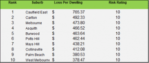
Here’s my national top 10 loss leaders for March 2021:
There are a number of ways the index can be used.
Firstly, it identifies those areas where tenants are in a stronger position to negotiate on rental terms because vacancies are causing the most financial pain for landlords.
As you can see from the table above, a Caufield East landlord is losing an average of $765.37 per month per property due to vacancy. The reason Caufield East has a large average monthly loss is that the rent figure here is relatively high, and oversupply is causing properties to become vacant at this elevated rental amount.
Compare this to somewhere like North Gosford NSW where landlords are only losing $4 on average per property per month.
If I’m a cash flow motivated investor, I know which suburb I’d rather invest in.
This handy index can also help buyers weight up the cost-benefit of cash flow vs. capital growth too. For example, if you are a high-income earner and can afford to cover vacancy losses, you might still choose to go with Caufield East because the property has excellent capital growth potential.
Of course, watching how the index trends over the coming months will also reveal new information. For example, we’ll be able to spot trends such as suburbs with least risk of rental losses, or locations where investor are at most risk of falling income.
The upside
It’s not all news about losses either. By applying the same measures in reverse, I have been able to identify regions where investors are keeping their income losses to a minimum. Here are the March results for those with minimal vacancy-driven rent loss:
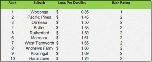
These are the nation’s ‘safe haven’ regions and should be a top research priority for those looking to keep their losses to a minimum.
You might be able to tell, I’m a bit excited about these new numbers. They’re another useful tool for investors looking to identify prime investment hotspots.
Not a bad set of numbers I reckon, even if I do day do myself.
To keep track of the index as it evolves, check out: https://rentlossindex.com.au/